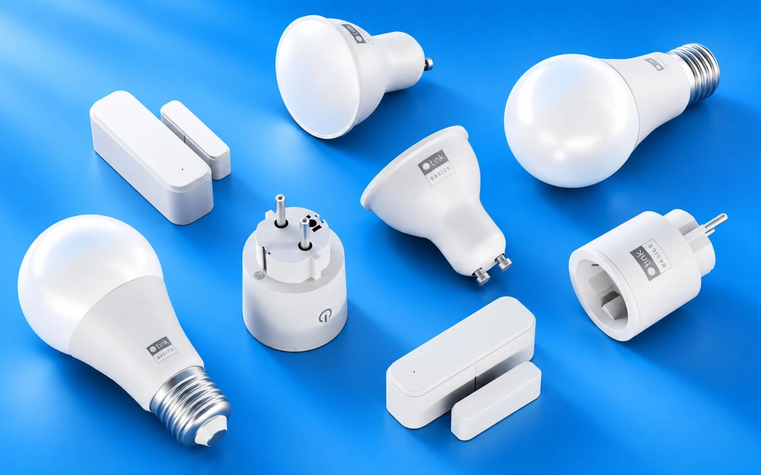
tink Basics
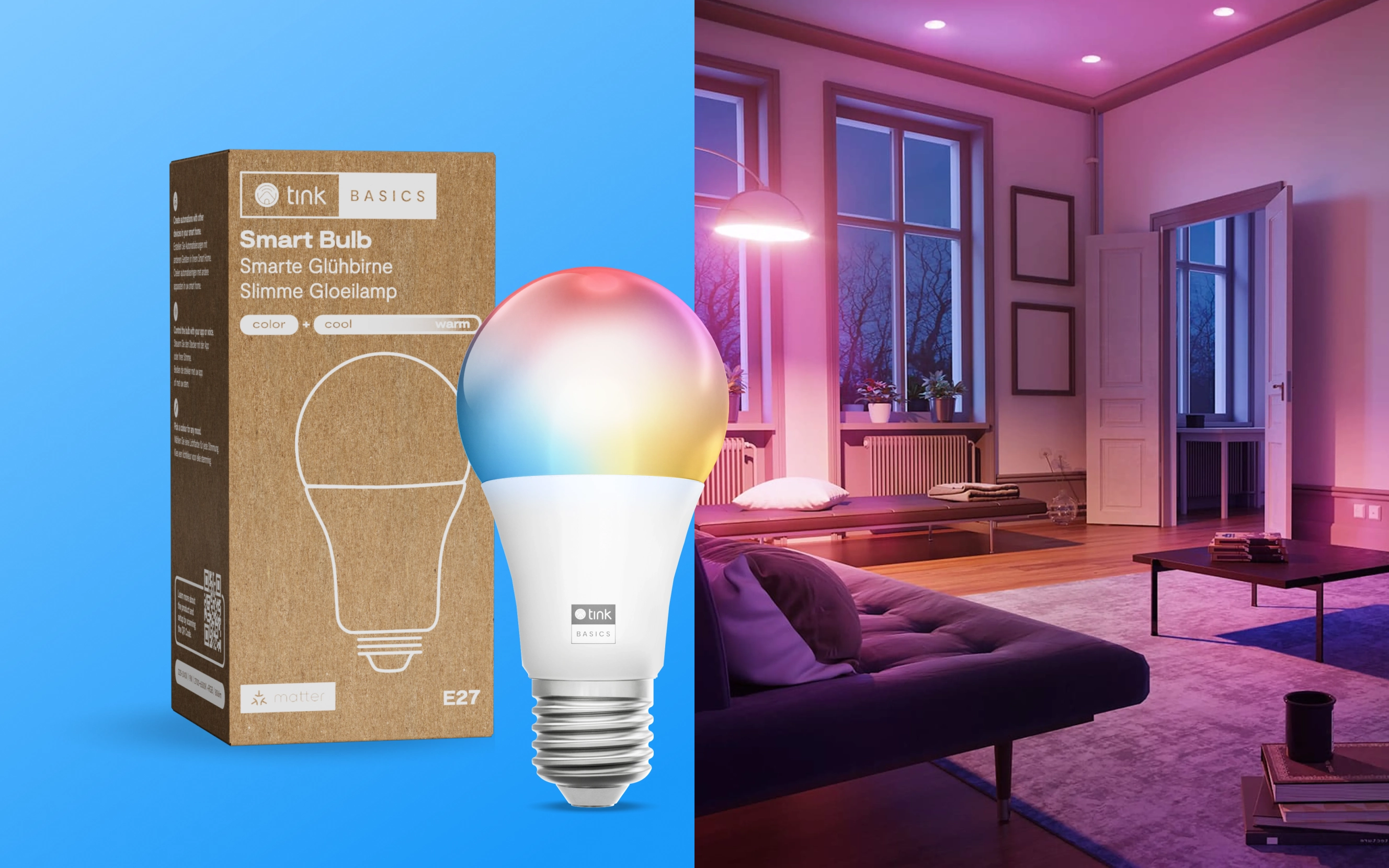
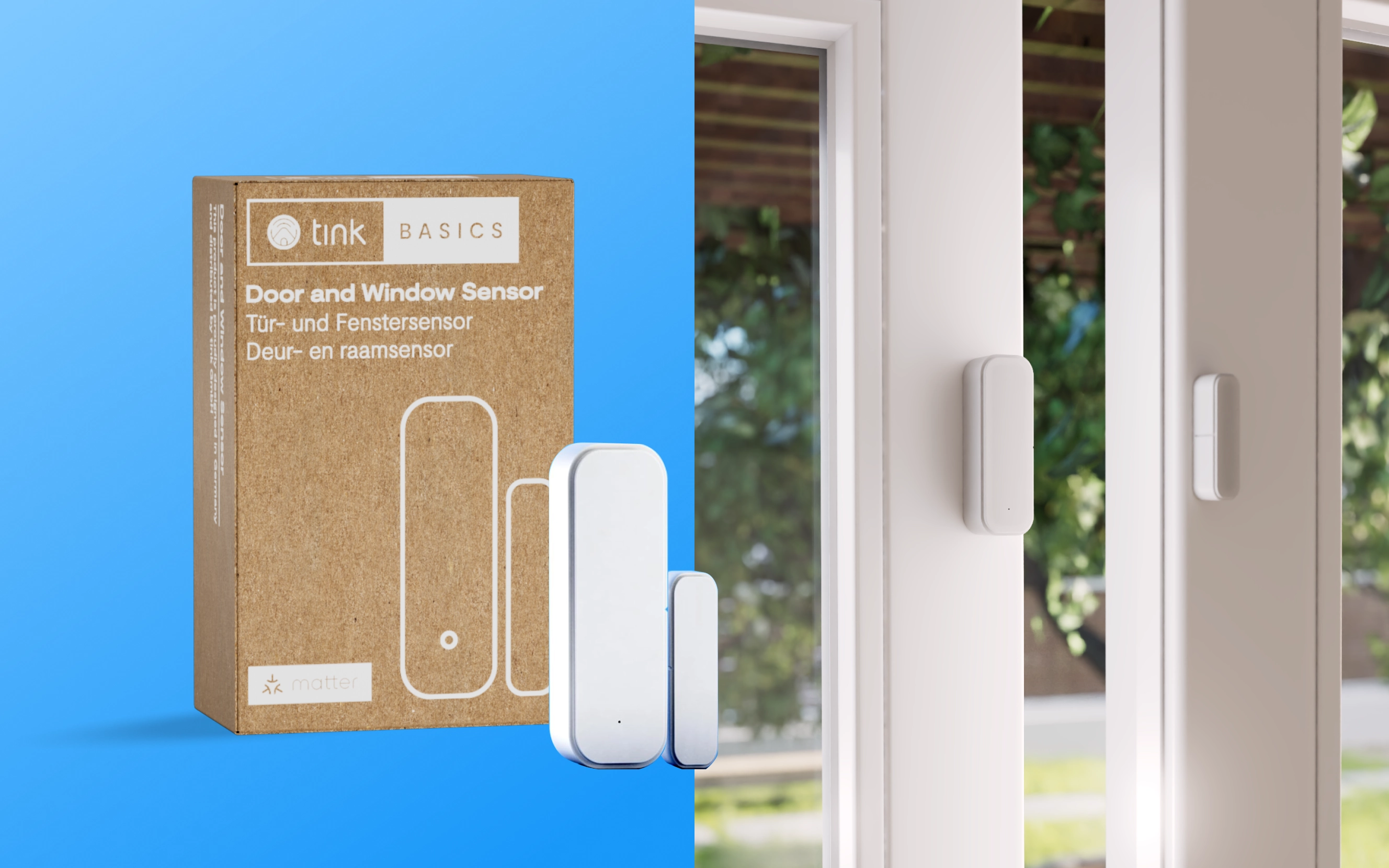
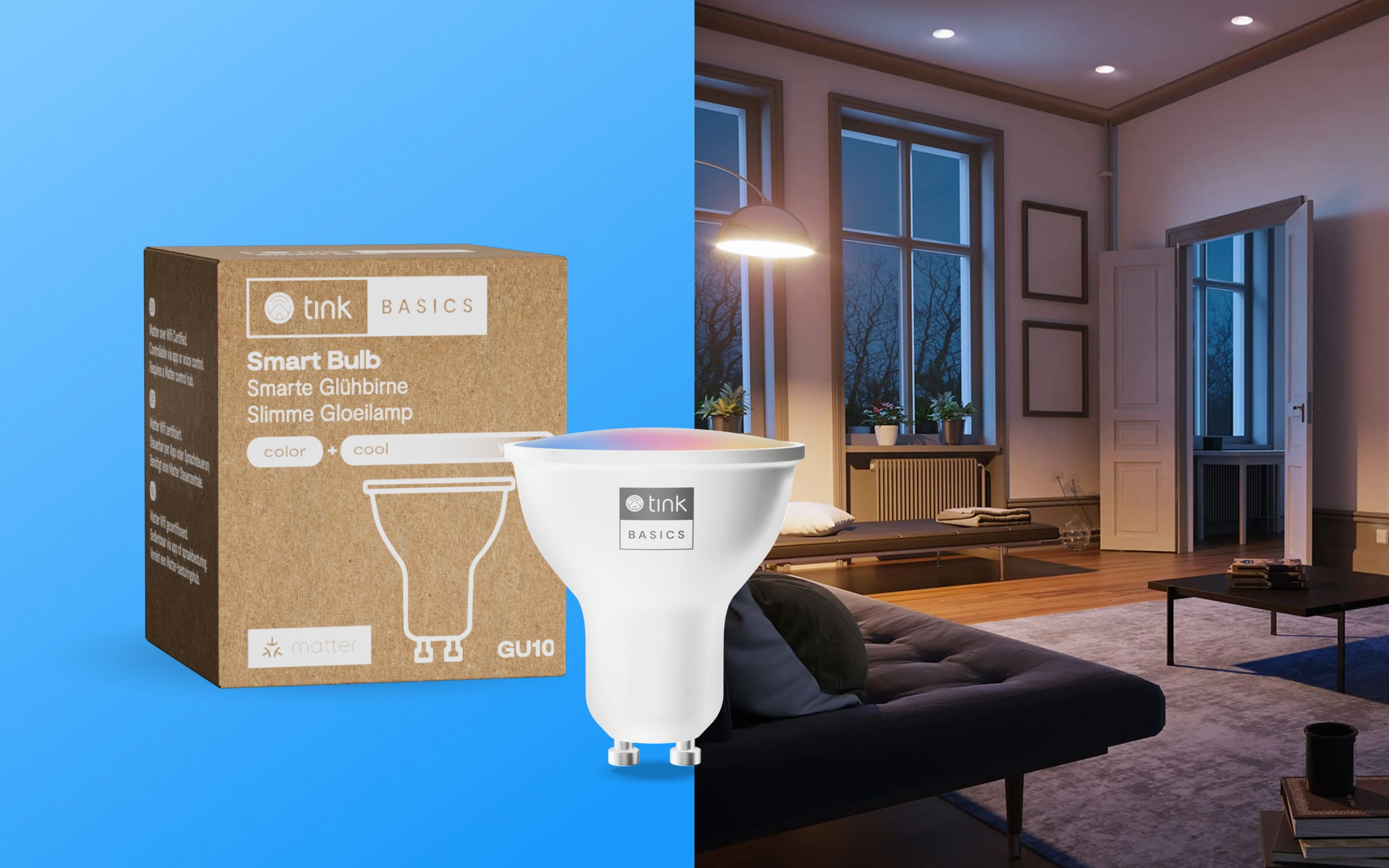
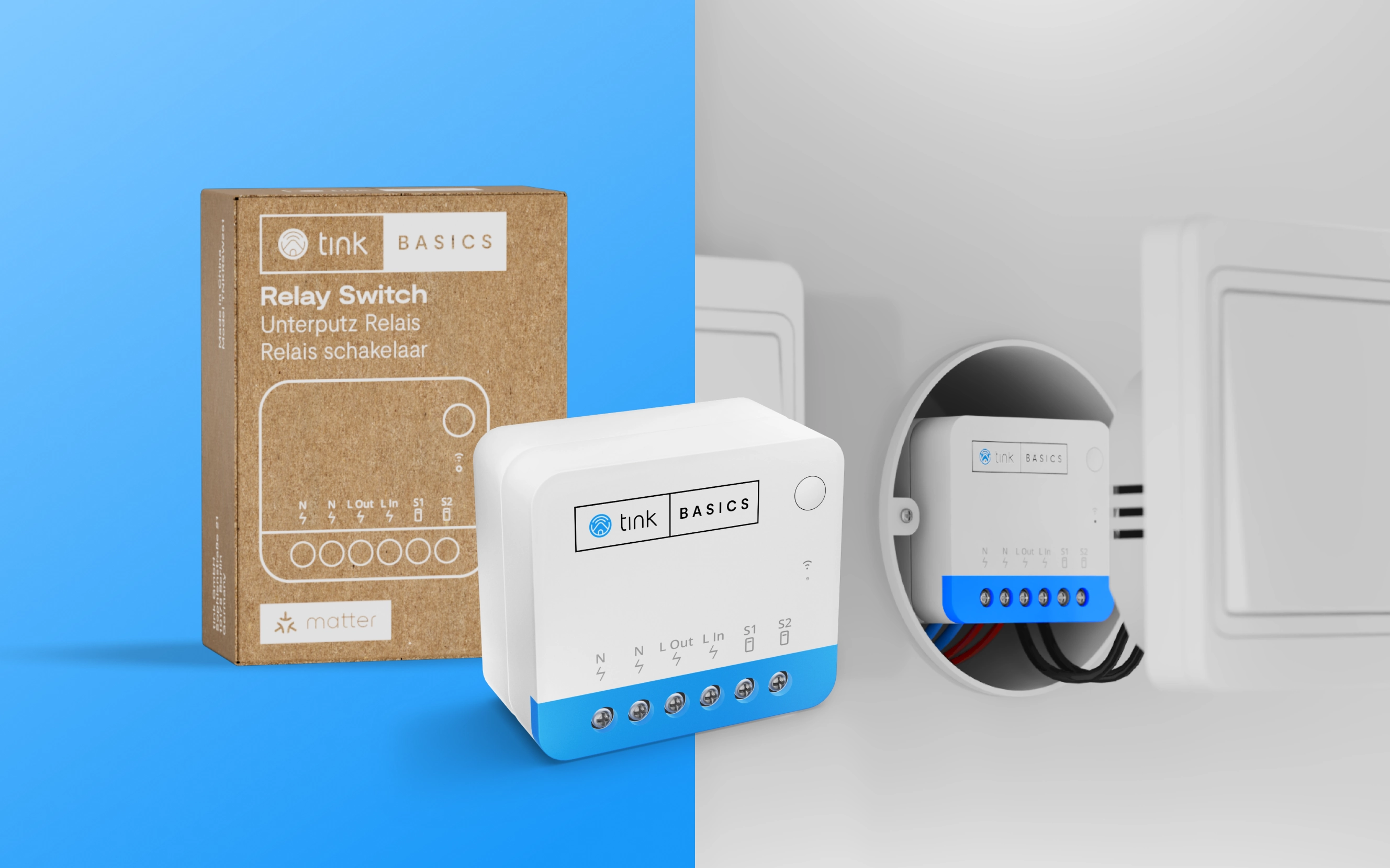
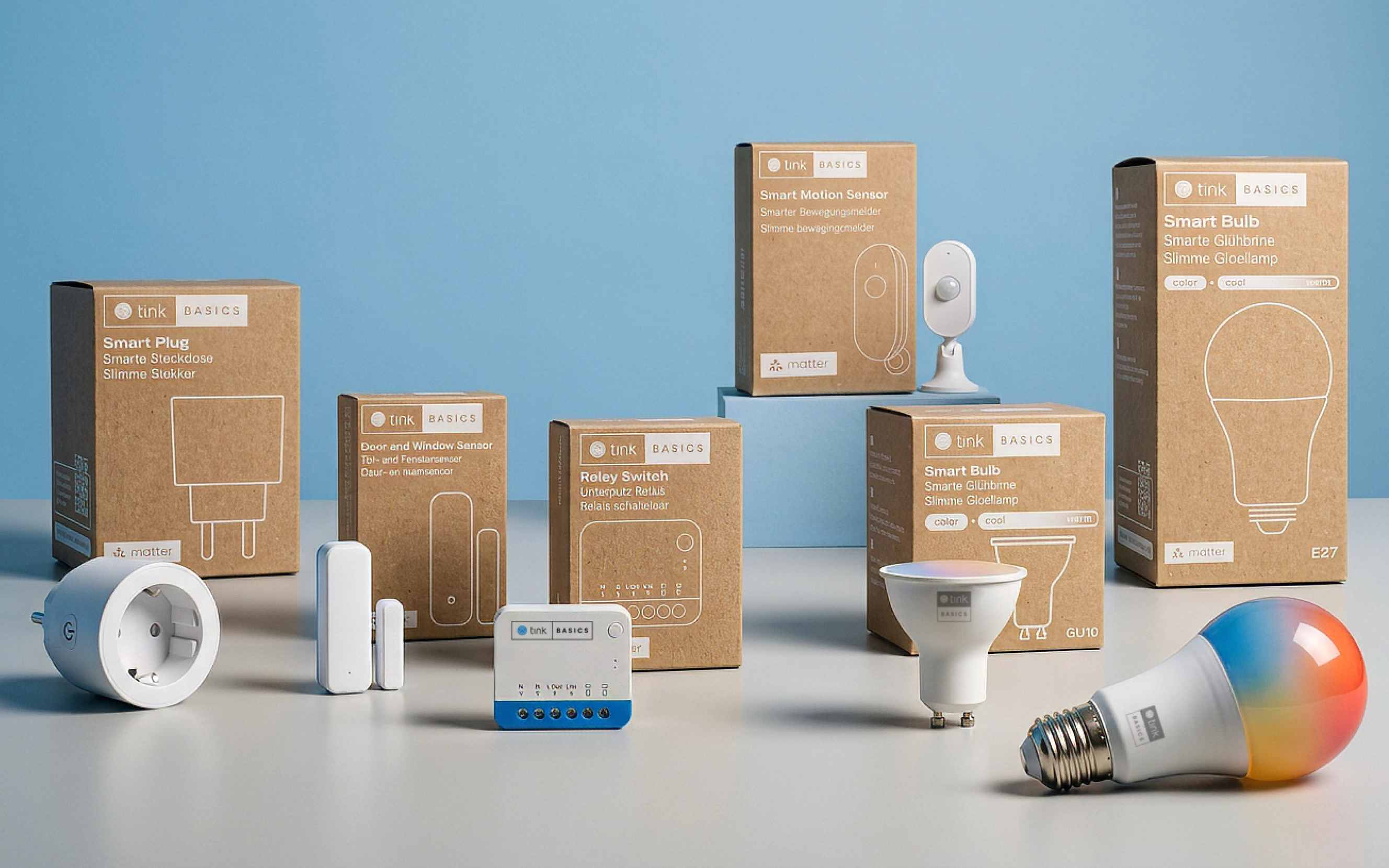
tink Basics is tink's own range of smart home essentials: smart plugs, bulbs, door and window sensors, motion sensors and relay switches, all Matter-compatible. The range needed an identity and packaging system that made the smart home feel simple and accessible to everyone, while standing for products built to last rather than built to a price.
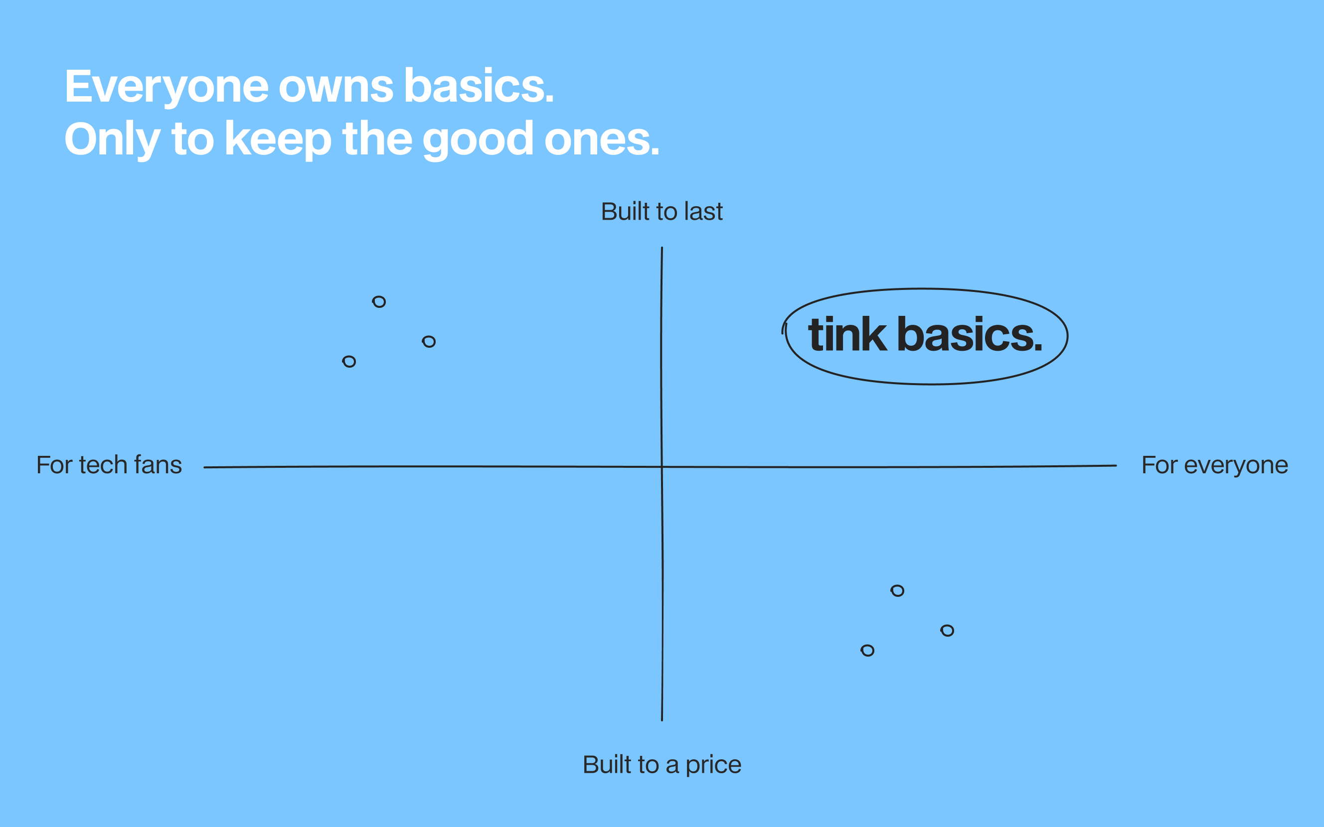
Everyone owns basics, but only the good ones are worth keeping. The positioning placed tink Basics in the space most smart home products miss: built to last, yet made for everyone rather than only for tech fans.
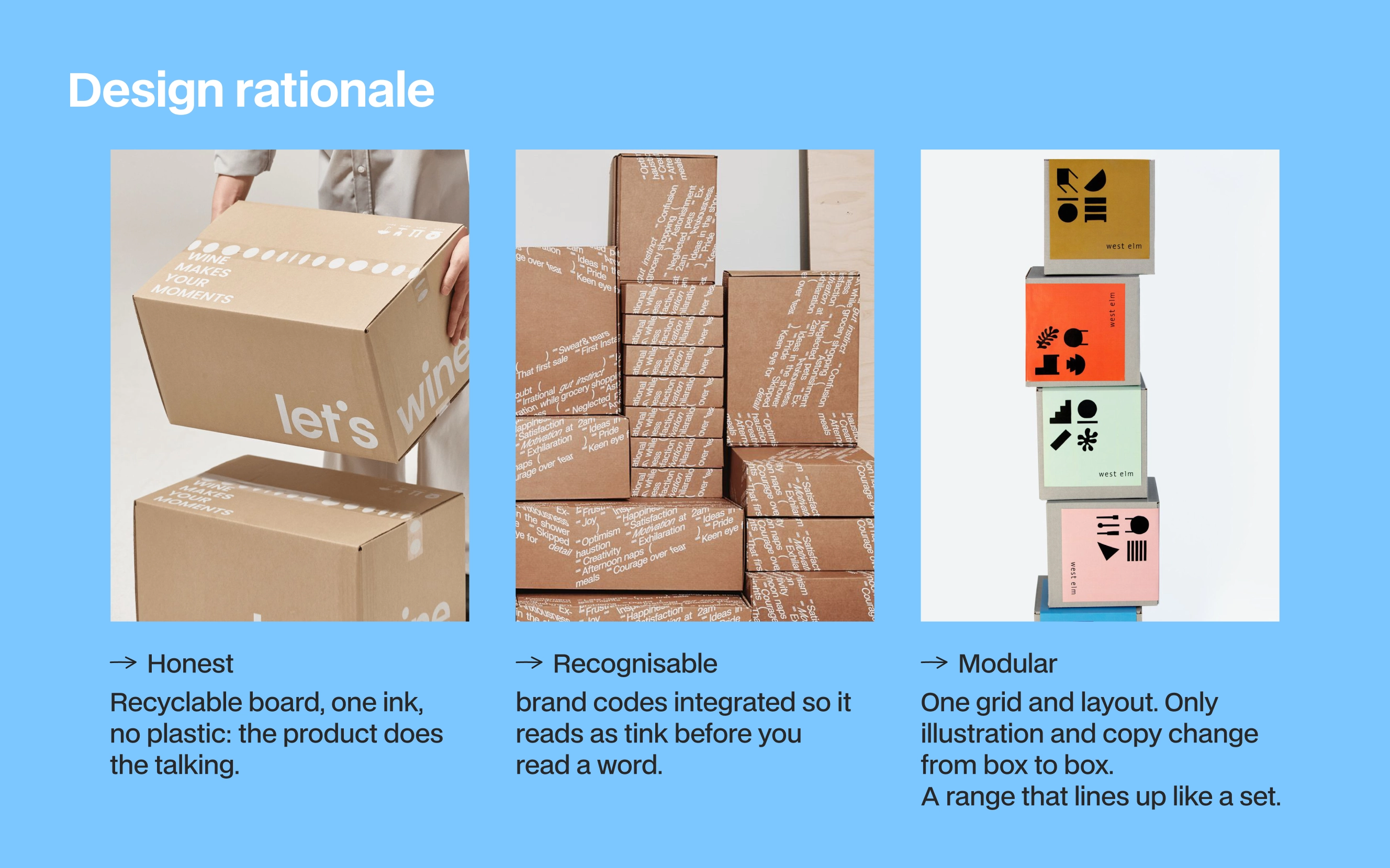
The packaging followed three principles.
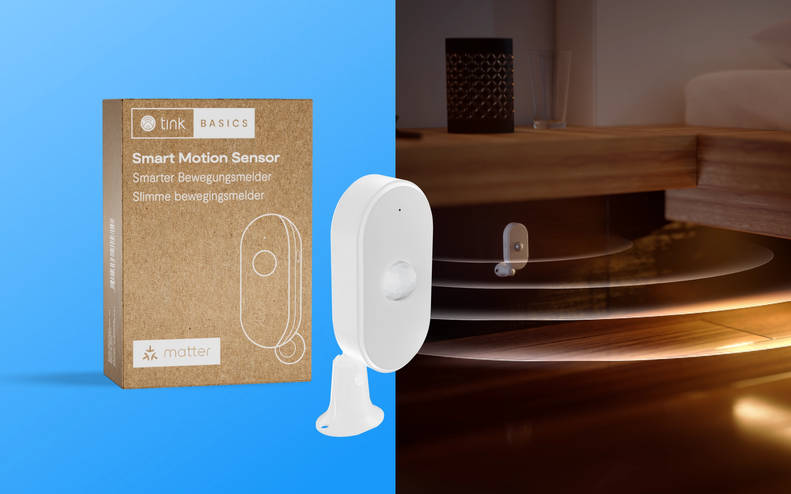
→ Honest: recyclable kraft board, a single ink and no plastic, so the product does the talking.
→ Recognisable: tink's brand codes integrated so the box reads as tink before a single word is read.
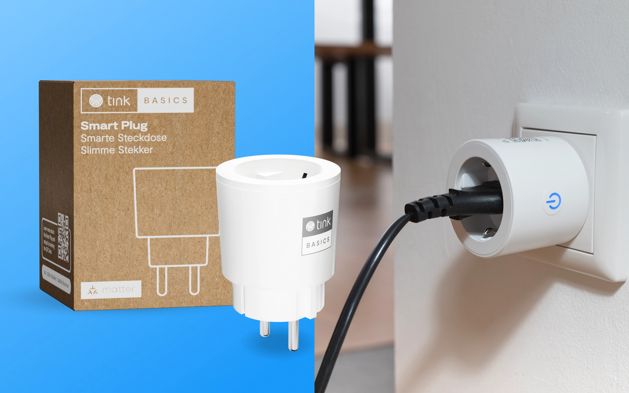
→ Modular: one grid and one layout across the whole range, where only the line illustration and the copy change from box to box. Each product is drawn as a simple white outline, named in German, English and Dutch, and carries the tink | BASICS lockup, which also appears on the devices themselves. The result is a range that lines up like a set, on the shelf and on screen.
- Positioning and design rationale
- Packaging art direction
- Product and lifestyle visuals
- 3D products imagery
Client: tink
Year: 2025
Duration: 6 months launch
Role
Creative Director
Team
Business Developer Owner: Florian Rheinheimer
Designer Art Direction: Maria Freitas Oliveira
Graphic Designer: Sophia Fernandez
3D Designer: Gordon Zimmermann
Creative Direction: Paula Carbonell